Your brand colors aren’t just decoration. They’re psychological weapons. Consumers make snap judgments about products within 90 seconds. Between 62% and 90% of that assessment comes from color alone. Color increases brand recognition by 80%. Some 85% of consumers say color is the main reason they choose one product over another.
Let’s take a deeper look at the top color generators that are used for branding in 2026.
Why Your Brain Cares This Much About Colors
Color psychology isn’t marketing fluff. It’s neuroscience. Different colors trigger different emotional responses. Red increases your heart rate and creates urgency. Blue lowers blood pressure and builds trust. Yellow stimulates optimism and grabs attention.
Brands leverage this constantly. Fast food logos use red and yellow. McDonald’s, Burger King, Wendy’s, KFC. The combination triggers hunger and creates urgency to buy now. Financial companies drown in blue. Chase, American Express, PayPal, Visa. The color communicates trustworthiness and stability.
The color choices aren’t accidents. They’re strategic decisions worth millions in brand equity.
Research shows color influences purchase intent differently across gender and cultural lines. What works for American millennials bombs with Asian Gen Z. Your perfect palette depends on who you’re selling to.
The 2026 Color Trends Reshaping Brand Palettes
Consumer research shows 36% of people expect brands to use either earthy organic tones or futuristic AI-generated colors in 2026.
The earthy side includes muted browns, sage greens, terracotta, and sun-bleached pastels. These palettes communicate authenticity and sustainability. Perfect for wellness brands and eco-conscious companies. The futuristic side features metallics, iridescent shades, and sci-fi-inspired palettes. These colors scream innovation and technology. Tech startups and AI companies gravitate here.
Another trend gaining traction: adaptive “living color palettes” that shift based on user preferences. Some 30% of consumers want brands to offer this personalization. While yellow is a notable ongoing color trend, the official 2026 Color of the Year announced by the Pantone Color Institute is actually “Cloud Dancer,” a soft white hue.
Clubroom Contrast pairs deep blacks with metallic gold for instant luxury positioning. This palette dominates high-end brands throughout 2026.
The 10 Best Color Palette Generators You Actually Need
| Text-based palettes | Primary strength | AI usage | Visual preview | Accessibility support | In the editor workflow |
| Coolors | Fast palette generation | Partial | Limited | Yes | Free and paid |
| Adobe Color | Professional color theory | No | Limited | No | Free |
| Colormind | AI driven palettes | Yes | Yes | No | Free |
| ColorMagic | AI-driven palettes | Yes | No | No | Free |
| Palettemaker | Live design previews | No | Yes | No | Free |
| Color Hunt | Community palettes | No | No | No | Free |
| Huemint | Brand focused machine learning | Yes | Limited | No | Free |
| Khroma | Personalized palette learning | Yes | Limited | No | Free |
| ColorSpace | Gradient generation | No | Limited | No | Free |
| Canva Color Generator | In editor workflow | Partial | Yes | No | Free and paid |
1. Coolors
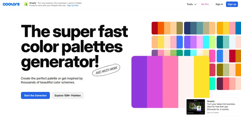
Coolors dominates for one reason. Speed. You hit the spacebar. Boom, five harmonious colors appear. Don’t you like them? Hit spacebar again. New palette instantly. The generator produces over 50,000 palettes daily across its 2 million active users.
The lock feature separates Coolors from competitors. Have you found one color you love? You can choose it and generate new palettes with that color as the basis. The algorithm ensures new colors complement your locked choice perfectly.
The image picker changed everything. Upload any photo. Coolors extracts the dominant colors automatically. You can build entire brand palettes from inspiration images. Wedding photo, sunset picture, favorite artwork. The generator pulls professional color schemes from anything visual.
Accessibility checking comes built in. The contrast checker ensures your text remains readable on your chosen backgrounds. You meet WCAG standards automatically. This matters legally and ethically. One in twelve men and one in 200 women experience color blindness.
Best for: Fast palette generation, image-based inspiration, accessibility compliance
Cost: Free with limitations, Pro version $5/month ($36/year)
2. Adobe Color
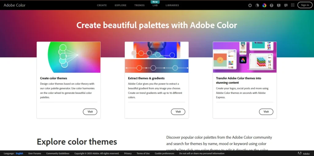
Adobe Color integrates seamlessly with the entire Creative Cloud ecosystem. You generate palettes directly in Photoshop, Illustrator, or Adobe Express. The tool offers multiple color harmony rules. Analogous, monochromatic, triad, complementary, compound. You pick the harmony type. Adobe generates palettes following that specific color theory.
The Extract Theme feature deserves special mention. Drag any photo into the tool. Adobe automatically creates a pleasing palette from the most prominent colors. The AI understands which colors work together visually.
The community library hosts thousands of pre-made palettes. You can search by mood, season, industry, or specific colors. The trending section shows what’s popular among designers right now.
Best for: Adobe users, designers wanting color theory control, community inspiration
Cost: Free with an Adobe account
3. Colormind
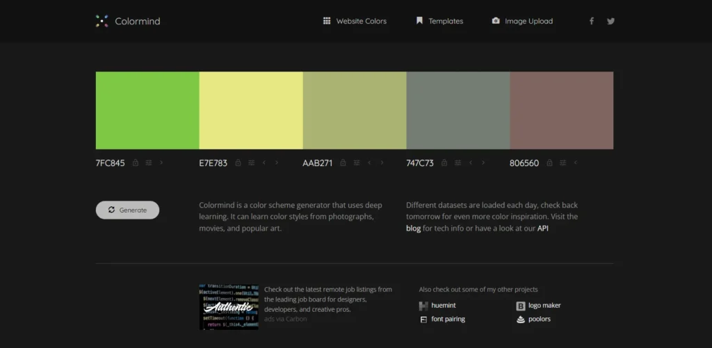
Colormind uses deep learning trained on photographs, movies, and popular art. The AI learned color styles from actual visual culture, not just theoretical color wheels. The UI preview feature shows your palette on actual website designs. You see how colors work as the main brand color, background shade, and accent buttons. The preview removes guesswork from implementation.
Different datasets are loaded each day. You get fresh inspiration constantly. The AI might train on sunset photos one day, classic films the next, modern art another day.
The placement matters in Colormind. Put complementary colors at opposite ends of the palette before locking them. The generator tends to produce beautiful intermediate values automatically.
Best for: Web designers, AI-powered suggestions, visual context
Cost: Completely free
4.ColorMagic
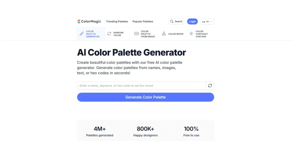
ColorMagic generates palettes from text descriptions. You type “ocean sunset,” or “cozy coffee shop,” or “cyberpunk city.” The AI creates matching color schemes instantly. The brand name feature impresses. You have to type any company name. ColorMagic generates palettes matching that brand’s aesthetic. You can analyze competitor colors without visiting their websites.
Gradient generation comes included. The tool creates ready-to-use CSS code for gradient backgrounds. You get the visual effect and the implementation code simultaneously.
The character palette feature gained popularity on social media. You can type a Disney character name, and the generator produces accurate color palettes. Ariel gets ocean blues and seafoam greens. Jasmine receives warm golds and rich purples.
Best for: Text-based inspiration, social media content, CSS gradients
Cost: Completely free
5. Palettemaker
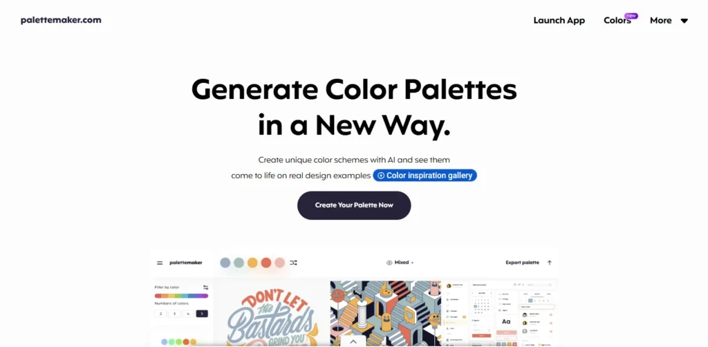
Palettemaker shows your colors on real design examples. Logo mockups, UI designs, posters, illustrations. You see how the palette performs across different applications before committing. The tool supports 2-6 color palettes. You can test minimalist two-color schemes or complex six-color systems. The flexibility accommodates different brand needs.
Filters let you browse palettes by color tone and number of colors. Looking for warm palettes with four colors? The tool shows you options matching those criteria. The export formats include everything designers need. Procreate, Adobe ASE, image files, even code. Your palette travels wherever your design work goes.
Best for: Visual thinkers, testing colors in context, designers
Cost: 100% free forever
6. Color Hunt
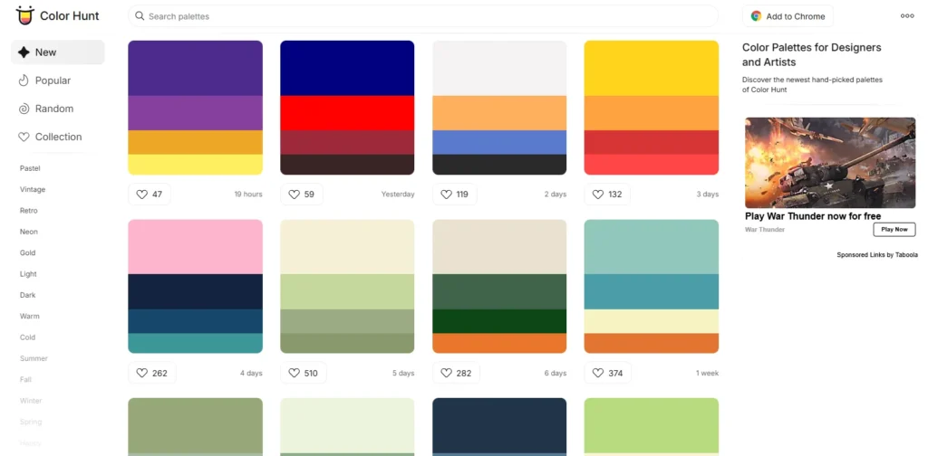
Color Hunt started as friends sharing favorite combinations. The collection now hosts thousands of palettes uploaded by designers worldwide. The trending section reveals what’s currently popular. You can spot emerging color trends before they hit mainstream brands.
Collections organize palettes by theme, season, or mood. Do you need summer palettes, christmas colors, or vintage schemes? Collections save you from scrolling through thousands of options.
The four-color standard creates consistency. Every palette uses exactly four colors. This limitation forces creative constraint. You can’t hide behind complexity.
Best for: Trend spotting, community inspiration, themed collections
Cost: Free
7. Huemint
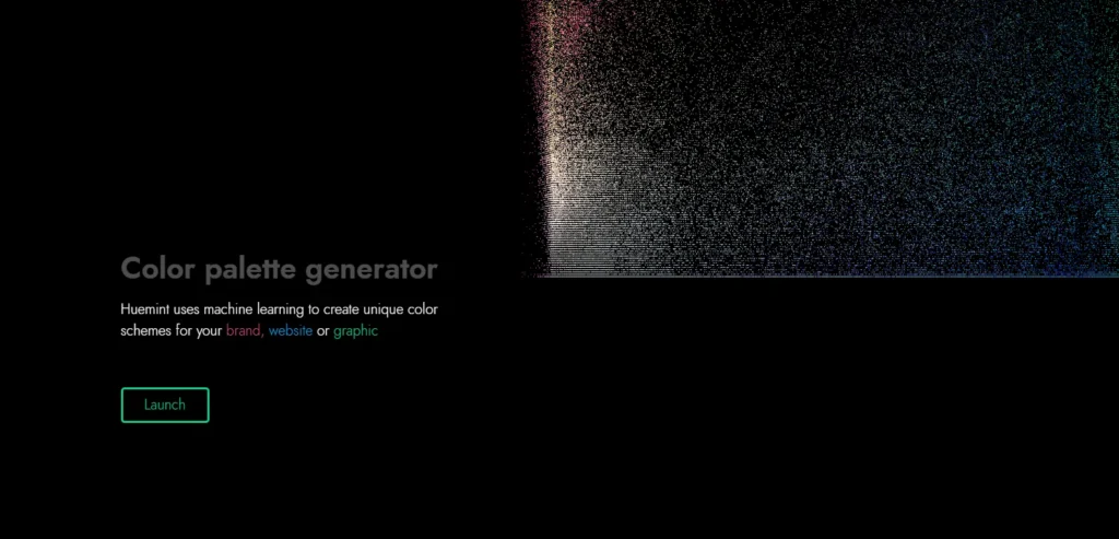
Huemint uses machine learning specifically for brand applications. The AI understands how colors work in logos, websites, and graphic designs. The contextual generation impresses. Tell Huemint what you’re designing. Website? Logo? Social media? The algorithm adjusts recommendations based on the specific use case.
The tool produces unique combinations you wouldn’t find through traditional color theory. Machine learning identifies patterns human designers might miss.
Results feel fresh because Huemint doesn’t rely on standard color harmonies. The AI learned from successful designs, not textbook rules.
Best for: Brand designers, unique combinations, AI-powered creativity
Cost: Free
8. Khroma
Khroma trains on your preferences. You select 50 colors you like. The AI generates palettes based exclusively on your chosen colors. Machine learning improves over time. The more you use Khroma, the better it understands your taste. The algorithm identifies patterns in your color preferences.
The initial setup requires work. Choosing 50 colors feels tedious. The payoff comes when Khroma generates palettes perfectly matching your aesthetic without further guidance.
The personalization makes Khroma unique. Other generators produce the same results for everyone. Khroma creates palettes specific to your visual preferences.
Best for: Designers with defined taste, personalized palettes, repeated use
Cost: Free
9. ColorSpace
ColorSpace excels at gradient generation. Enter one color. The tool produces matching gradients instantly. The color code flexibility helps. You can input RGB values, hex codes, or recreate colors directly on the color wheel. The tool accepts color information, however you provide it.
The matching palette generator shows generous options. One input color produces dozens of complementary schemes. You see more possibilities than most generators offer.
The gradient CSS code is exported and ready to use. You get the visual gradient and the code to implement it on websites.
Best for: Web designers, gradient creation, code export
Cost: Free
10. Canva Color Palette Generator
Canva integrates palette generation directly into the design workspace. You don’t leave the editor to pick colors. The Magic Write feature generates palettes from text prompts. Describe your brand or project. Canva creates matching color schemes.
Multi-language support includes English, French, Spanish, Portuguese, Indonesian, and more. The global accessibility helps international brands.
The Translate tool converts your entire palette into 100+ languages. Color names, hex codes, and everything translate to help international teams communicate.
Best for: Canva users, international teams, in-editor convenience
Cost: Limited free use, unlimited with Canva Pro
| Use Case | Best Choice | Why It Wins |
| Fast palette generation | Coolors | Instant results with lock & spacebar workflow |
| Brand design | Huemint | ML trained on real branding use cases |
| Web/UI design | Colormind | Live website previews reduce guesswork |
| Accessibility compliance | Coolors | Built-in WCAG contrast checker |
| Community inspiration | Color Hunt | Trend-based, designer-curated palettes |
| Text-based inspiration | ColorMagic | Converts keywords into usable palettes |
| Personal taste learning | Khroma | Adapts over time to individual preferences |
| Gradient creation | ColorSpace | Gradient-first with ready CSS |
| Adobe workflow | Adobe Color | Seamless Creative Cloud integration |
| Canva-based design | Canva Generator | No context switching inside Canva |
How to Actually Pick Colors That Sell
Most people waste color palette generators. They generate one palette, pick colors they personally like, and call it done. Professional color selection follows a process:
Define Your Brand Personality First
Colors communicate personality before words get a chance. You can’t pick effective colors without knowing what personality you’re expressing. Ask yourself these questions. What emotion should people feel seeing your brand? Excited? Calm? Powerful? Playful? The answer determines your color direction.
Write down five adjectives describing your ideal brand perception. Bold, trustworthy, innovative, warm, professional. Your color palette should embody these words visually.
Research Your Industry’s Color Language
Every industry has color conventions. Breaking them requires intentional strategy. Financial services live in blue because it signals trust and stability. Health and wellness brands embrace greens for their association with nature and vitality. Food brands use warm reds, oranges, and yellows to stimulate appetite.
Research your top five competitors. What colors dominate your space? You need to either align with industry expectations or deliberately contrast them. Both strategies work. Aimless selection doesn’t.
Generate Multiple Palette Options
Don’t settle on the first palette you like. Generate 15-20 complete palettes across different generators. Different tools use different algorithms. Coolors produces different results than Adobe Color using identical starting colors. The variety helps you see possibilities you’d miss using one generator.
Save everything in a document. Screenshots work fine. You’ll compare options side by side later.
Test Palettes on Actual Mockups
Colors look different in isolation versus application. Your perfect palette might fail when applied to actual designs.
Use tools like Palettemaker or Colormind to preview colors on real website layouts. Does your text remain readable? Do accent colors pop appropriately? Does the overall feel match your brand personality?
Create simple mockups of your logo, website header, and social media posts using each palette. The winners become obvious through application.
Run the Accessibility Check
Legal compliance aside, accessible design reaches more customers. The contrast between text and background colors must meet minimum standards.
Both Coolors and Adobe Color include built-in contrast checkers. Use them. Your color choices might look beautiful, but fail accessibility requirements.
The math is simple. Normal text needs a contrast ratio of at least 4.5:1. Large text needs 3:1. Headlines and UI elements need 3:1. Any less becomes difficult to read for people with visual impairments.
Get External Feedback From Target Customers
Your personal color preferences don’t matter. Your target customer’s preferences do.
Create a simple survey with your top five palette options. Ask customers which one best represents the emotions you’re trying to convey. Their answers override your opinions.
Family and friends give useless feedback. They’ll pick whatever makes you happy. Survey actual customers or people matching your target demographic.
Common Color Mistakes That Tank Brands
Following Trends You Don’t Understand
That trendy Banana Yellow looks amazing on Instagram. Does it match your brand personality? Will it resonate with your specific audience?
Trends work when they align with your brand strategy. They bomb when you chase them because they’re popular. Stick with your brand personality over trend chasing.
Ignoring Cultural Color Meanings
Colors mean different things in different cultures. White signals purity in Western cultures. It represents death and mourning in many Eastern cultures.
Red means luck and celebration in China. It signals danger or debt in Western contexts. Green represents Islam in Middle Eastern countries. It means envy or sickness in some Western contexts.
Research your target markets. A color palette that crushes in America might offend audiences in Asia or the Middle East.
Picking Too Many Colors
Effective brand palettes typically use 3-5 colors maximum. Primary color, secondary color, 1-3 accent colors. More colors create visual chaos.
Look at successful brands. Apple uses white, black, and gray primarily. Coca-Cola sticks to red and white. McDonald’s uses red, yellow, and minimal black. Simplicity wins.
Failing to Test Mobile Display
Colors display differently on mobile screens versus desktop monitors. That subtle beige looks gray on phones. Your carefully chosen purple appears darker on tablets.
Test your palette on multiple devices before finalizing. Screenshots don’t cut it. View the actual colors on actual screens.
Choosing Colors That Don’t Scale
Your palette needs to work across every application. Websites, business cards, billboards, social media, packaging, signage.
Some colors fail in specific formats. Neon colors look terrible in print. Subtle gradients disappear on billboards. Think about where your brand appears most frequently. Pick colors that work in those primary applications.
Final Thoughts
Consumers form judgments about your brand in 90 seconds. Color accounts for up to 90% of that assessment. Your color palette carries more weight than almost any other branding decision. The right colors increase brand recognition by 80%. They influence 85% of purchase decisions. They create emotional connections that transcend rational comparison.
Color palette generators put professional color theory in your hands. You don’t need expensive designers or years of study. You need the right tool and the willingness to test rigorously. Start with three generators from this list. Colors for speed and image extraction. Adobe Color for color theory control. Colormind for AI-powered visual context. Generate 20 palette options. Test them on mockups. Survey your target customers.
The perfect palette exists for your brand. These free generators help you find it without breaking the bank. Your colors matter. Choose them with intention. Test them with discipline. Deploy them with consistency.