The right color scheme creates instant emotional connections. The wrong one repels customers before they read your headline. Color scheme tools changed everything. These free generators put professional color theory in your hands. You don’t need to understand complementary relationships or triadic balance. The tools handle the science.
This article shows you the 10 best free color scheme tools available in 2026.
What Makes a Color Scheme Actually Work
Most people think color schemes are about picking pretty colors. Wrong. A color scheme is a strategic combination of colors based on their relationships on the color wheel. These combinations follow proven patterns that create visual harmony or intentional tension.
The six main color scheme types dominate professional design:
- Complementary schemes use colors directly opposite each other on the color wheel. Blue and orange. Red and green. Purple and yellow. These combinations create maximum contrast and visual energy. They grab attention instantly but can overwhelm if used incorrectly.
- Analogous schemes use three colors sitting next to each other on the wheel. Blue, blue-green, and green. Red, red-orange, and orange. These combinations feel harmonious and natural because they create smooth transitions. Nature uses analogous schemes constantly.
- Triadic schemes use three colors evenly spaced around the color wheel. Red, blue, and yellow. Orange, green, and purple. These combinations offer vibrant contrast while maintaining balance. Google and Microsoft both use triadic schemes in their logos.
- Monochromatic schemes use different shades, tints, and tones of a single color. Light blue, medium blue, dark blue. These sophisticated schemes feel cohesive but require skill to avoid looking boring.
- Split-complementary schemes use a base color plus the two colors adjacent to its complement. This creates high contrast with less tension than pure complementary schemes.
- Tetradic schemes use four colors forming two complementary pairs. These complex schemes offer lots of variety but need careful balancing to avoid visual chaos.
Understanding these relationships helps you pick the right tool for your project. Different tools excel at different scheme types.
The Statistics That Prove Color Schemes Matter
Recent research from Adobe showed some stunning findings. Nearly 16% of consumers say the first thing they notice about a brand is its color scheme. One in two consumers has chosen one brand over another based purely on color.
Blue ranks as both the top color for building trust and the most likely to trigger impulse purchases. Some 31% of consumers make snap buying decisions when seeing blue in branding.
The 2025 Creative Trends Report revealed 56% of brands credit their color schemes with significantly improving digital engagement metrics. Click-through rates jump. Time on page increases. Bounce rates drop.
Color influences 85% of purchase decisions according to studies. Your color scheme does more conversion work than your copywriting, your product photography, or your pricing strategy.
Strategic color choices increase call-to-action button clicks by up to 34%. Change your button color from gray to red? You might see a third more clicks without changing anything else.
The numbers tell a clear story. Your color scheme matters more than almost any other design decision you’ll make.
The 10 Best Free Color Scheme Tools You Need
1. Coolors
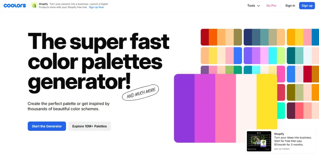
Coolors generates harmonious five-color schemes faster than any competitor. You hit the spacebar. Instant perfect palette. Don’t you like it? Hit spacebar again. New palette appears.
The tool generates over 50,000 color schemes daily across its 2 million users. The lock feature separates it from competitors. Have you found one color you love? Lock it in place. Generate new schemes that complement your locked color.
The image extraction feature changed how designers work. Upload any photo. Coolors pulls the dominant colors automatically. You can build entire brand schemes from inspiration images.
The tool includes accessibility checking. Your text needs a readable contrast against backgrounds. Coolors tests this automatically using WCAG standards.
Best for: Fast generation, image-based schemes, beginners
Cost: Free with limitations, Pro at $5/month
2. Adobe Color
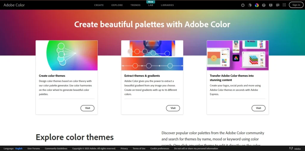
Adobe Color offers more control than any free tool available. The platform integrates with the entire Creative Cloud ecosystem. You generate schemes directly in Photoshop, Illustrator, or Adobe Express.
The tool provides six harmony rules. Complementary, analogous, triadic, tetradic, square, compound. You pick the relationship type. Adobe generates schemes following that specific color theory.
The Explore section hosts thousands of community-created schemes. You can search by color, mood, or keyword. The trending section shows what’s currently popular among designers.
The Extract Theme feature deserves special mention. Drag any photo into the tool. Adobe creates a perfect palette from the most prominent colors. The AI understands which colors work together naturally.
Best for: Adobe users, color theory control, professional design
Cost: Free with an Adobe account
3. Paletton
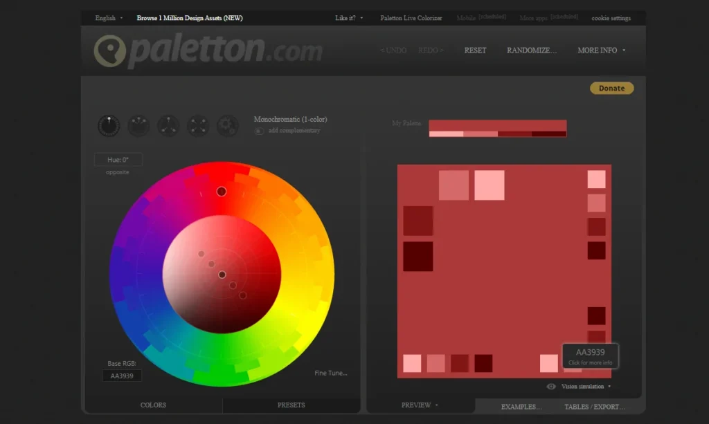
Paletton teaches you color theory while you design. The tool visualizes how colors relate on the wheel as you select them. The interface shows every harmony type available. Monochromatic, complement, triad, tetrad, freestyle. You pick the relationship. Paletton generates the scheme with mathematical precision.
The preview features help tremendously. You see your colors on example websites, images, and designs before committing. The tool simulates how your scheme works in real applications.
Paletton works for everyone, from professionals to kids doing school projects. The interface feels technical, but the results are always harmonious.
Best for: Learning color theory, technical precision, educational projects
Cost: Completely free
4. Colormind
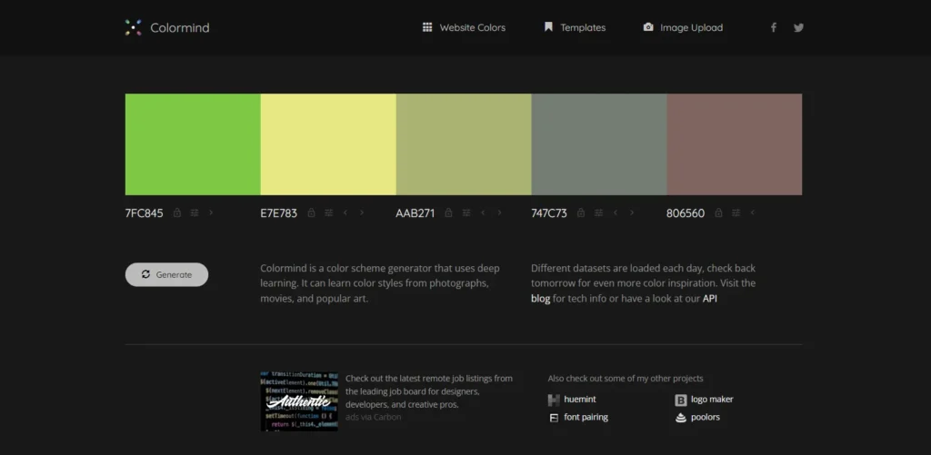
Colormind uses deep learning trained on photographs, movies, and popular art. The AI learned color styles from actual visual culture, not just theoretical wheels. Different datasets are loaded each day. Today, the AI might train on sunset photos. Tomorrow, on classic films. Next week on modern art. You get fresh inspiration constantly.
The UI preview feature shows your colors on actual website mockups. You see how colors work as the main brand color, backgrounds, and buttons. The tool removes guesswork from implementation.
Placement matters in Colormind. Put complementary colors at opposite ends before locking them. The generator produces beautiful intermediate values automatically.
Best for: AI-powered suggestions, web design, daily inspiration
Cost: Free forever
5. Color Hunt
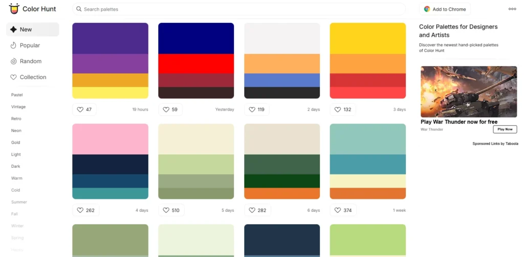
Color Hunt started as designers sharing favorite combinations with friends. The collection now hosts thousands of schemes uploaded by creators worldwide. The trending section reveals what’s currently popular. You spot emerging trends before they hit mainstream brands. The recency filter shows the newest schemes uploaded.
Collections organize schemes by theme. Summer palettes, Christmas colors, vintage schemes, pastel collections. You find exactly what you need without scrolling forever.
Every scheme uses exactly four colors. This consistency creates constraint. You can’t hide behind complexity. The limitation forces creative decisions.
Best for: Trend spotting, themed collections, quick inspiration
Cost: Free
6. Khroma
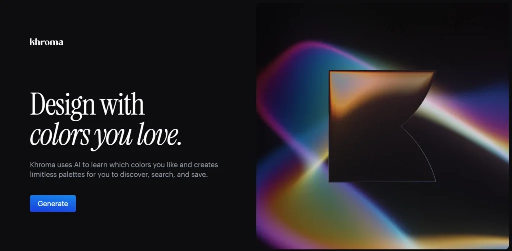
Khroma trains specifically on your color preferences. You select 50 colors you like. The AI generates schemes based exclusively on your chosen colors. Machine learning improves over time. The more you use Khroma, the better it understands your taste. The algorithm identifies patterns you might not notice yourself.
The initial setup requires work. Choosing 50 colors feels tedious. The payoff comes when Khroma generates perfect palettes without further guidance. The personalization makes Khroma unique. Other tools produce identical results for everyone. Khroma creates schemes specific to your visual preferences.
Best for: Consistent personal style, designers with defined taste
Cost: Free
7. ColorSpace
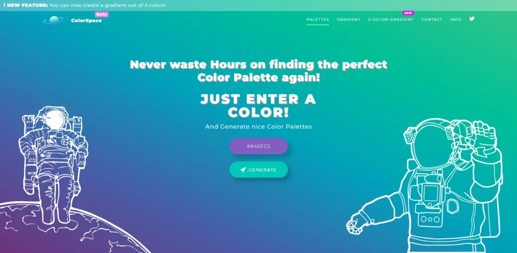
ColorSpace excels at creating color gradients. Enter one color. The tool produces matching gradients and palettes instantly. The tool accepts color input in any format. RGB values, hex codes, HSL values. You can recreate colors directly on the color wheel. The flexibility helps professionals working across platforms.
The matching scheme generator shows generous options. One input color produces dozens of complementary combinations. You see more possibilities than most generators offer.
The gradient CSS code is exported ready for websites. You get the visual gradient and the implementation code simultaneously.
Best for: Web designers, gradient creation, code export
Cost: Free
8. Canva Color Palette Generator
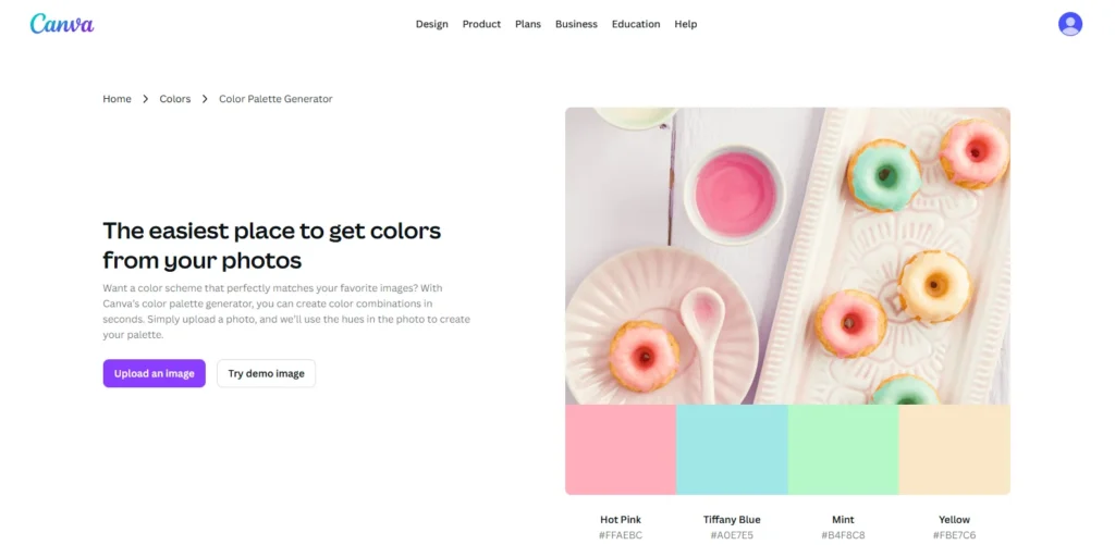
Canva integrates scheme generation directly into the design editor. You don’t leave your workspace to pick colors.
Upload any image. Canva extracts a four-color scheme automatically. The extraction understands which colors dominate and which work as accents. The tool supports multiple languages. English, French, Spanish, Portuguese, Indonesian, and more. International teams can collaborate using their native languages.
The limitation hits with the free version. You get limited scheme generations before hitting the paywall. Heavy users need Canva Pro.
Best for: Canva users, image extraction, international teams
Cost: Limited free, unlimited with Canva Pro
9. Figma Color Wheel

Figma built color scheme generation directly into the design platform. You create schemes without leaving your design file. The tool visualizes all six harmony types clearly. Complementary, analogous, triadic, split-complementary, square, monochromatic. You pick the relationship and see results instantly.
The interface feels intuitive for designers already working in Figma. You can apply colors directly to design elements with one click.
The limitation comes for non-Figma users. You need a Figma account to access the tool. The payoff makes it worthwhile if you design interfaces regularly.
Best for: UI/UX designers, Figma users, interface design
Cost: Free with a Figma account
10. Material Design Color Tool
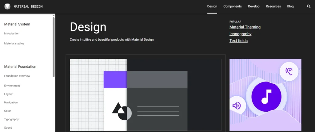
Google’s Material Design Color Tool focuses on accessibility and usability. The tool ensures your schemes meet contrast requirements automatically. You select primary and secondary colors. The tool generates multiple shades of each. The scheme is displayed on six UI mockups showing a real application.
The accessibility tester runs automatically. Your text needs a minimum contrast ratio against backgrounds. The tool highlights which combinations pass and which fail WCAG standards.
The material design focus makes this perfect for app designers. The schemes work beautifully on mobile interfaces.
Best for: App designers, accessibility compliance, mobile UI
Cost: Free
How to Pick Colors That Actually Sell
Most people waste color scheme tools. They generate one scheme, pick colors they personally like, and launch. This approach fails consistently.
Professional color selection follows a process:
Start With Your Brand Personality
Colors communicate personality before words get a chance. Energetic brands need different schemes than calm wellness companies. Write down five adjectives describing your ideal brand perception. Bold? Trustworthy? Innovative? Playful? Professional? Your color scheme should embody these words visually.
Warm colors like red, orange, and yellow create energy and urgency. Cool colors like blue, green, and purple build trust and calm. Your personality determines your temperature.
Choose the Right Scheme Type for Your Goal
Different scheme types create different effects. Complementary schemes grab attention aggressively. Analogous schemes feel harmonious and approachable. Monochromatic schemes communicate sophistication.
High-energy brands selling excitement should explore complementary or triadic schemes. Financial services building trust should test analogous or monochromatic schemes. The scheme type affects emotional impact as much as the specific colors.
Generate 15-20 Complete Schemes
Don’t settle on the first scheme you like. Use three different tools. Generate five schemes in each tool. Save everything.
Different tools use different algorithms. Coolors produces different results than Adobe Color using identical starting colors. The variety helps you see possibilities you’d miss using one generator.
Test Schemes on Actual Mockups
Colors look different in isolation versus application. Your perfect scheme might fail when applied to actual designs. Use tools like Colormind or Material Design Color Tool to preview schemes on website layouts. Does text remain readable? Do buttons pop appropriately? Does the overall feel match your brand?
Create simple mockups of your website, logo, and social media using each scheme. The winners become obvious through application.
Run Accessibility Tests
Legal compliance aside, accessible design reaches more customers. Text and background colors must meet minimum contrast standards. Both Coolors and Material Design Color Tool include contrast checkers. Use them. Beautiful colors that fail accessibility requirements lose you customers and potentially violate laws.
Normal text needs a 4.5:1 contrast ratio minimum. Large text needs 3:1. UI elements need 3:1. Any less becomes difficult for people with visual impairments to read.
Survey Your Target Audience
Your personal preferences don’t matter. Your target customer’s preferences matter exclusively. Show your top five schemes to actual customers or people matching your target demographic. Ask which one best represents the emotions you’re trying to convey. Their answers override your opinions.
Family and friends give useless feedback. They pick whatever makes you happy. Real customers tell you what actually works.
Common Color Scheme Mistakes That Kill Conversions
Using Too Many Colors
Effective schemes typically use 3-5 colors maximum. Primary color, secondary color, 1-3 accent colors. More colors create visual chaos and confusion.
Look at successful brands. Apple uses mostly white, black, and gray. Coca-Cola sticks to red and white. McDonald’s uses red and yellow with minimal black. Simplicity wins consistently.
Ignoring Industry Color Conventions
Every industry has color expectations. Finance lives in blue because it signals trust. Health uses green for its natural associations. Food brands favor warm colors that stimulate appetite.
You can break conventions intentionally. Breaking them accidentally makes you look unprofessional. Research your competitors before choosing scheme types that violate every norm in your space.
Forgetting About Color Blindness
About 8% of men and 0.5% of women experience color blindness. Red-green color blindness is most common. Your perfect red-green complementary scheme becomes invisible to millions of potential customers. Test your schemes with color blindness simulators. Both Coolors and Adobe Color include these features. Adjust schemes that fail the test.
Picking Colors That Don’t Print Well
Your scheme needs to work across all media. Websites, business cards, packaging, signage. Bright neon colors look amazing on screens. They look terrible in print.
Test your schemes on actual printed materials before committing. Some colors display differently on paper than on screens. This matters more than most people realize.
Final Thoughts
Your color scheme carries more weight than your copywriting, product features, or pricing. Get colors wrong, and nothing else matters because customers leave before reading anything. Free color scheme tools put professional design in your hands. You don’t need expensive agencies or design degrees. You need the right tool and the willingness to test rigorously.
Start with three tools from this list. Colors for speed and image extraction. Adobe Color for color theory control. Colormind for AI-powered context. Generate 20 schemes. Test them on mockups. Survey real customers.
Your perfect color scheme exists. These free tools help you find it without wasting time or money. Your colors speak louder than words. Your turn starts now.